My Role
Product Design
Interaction Design
UI Design
User Research
The team
CEO
Head of Business
Marketing
Ops
2 Software Engineers
2 Product Designers
Project Manager
Timeframe
Oct 2022 - Oct 2023
The Problem
With Singapore's ageing population at hand, there is a need to focus on preventive care to maintain healthy life expectancy. Regular health screenings and good continuity of care are important components of preventative care. Patients who opt for private health screenings, however, face higher costs. A lack of dedicated physicians that are aware of their medical history poses further challenges.
The Solution
The team identified 2 key solutions:
Make private health screenings more affordable
Enhance continuity of care by making dedicated physicians more accessible
The client, a clinical laboratory offering testing services, sought to sell health screening packages directly to patients, reducing costs, while also enabling streamlined medical report sharing between patients and clinics through a webapp.
Impact
Our team undertook the challenge of guiding the client in developing their first digital product, through the process of defining, designing, and building for beta release. My main impact:
Led the design of a product from discovery to beta launch and achieved B2B and B2C sales of health screening packages within a year
Facilitated workshops to define business requirements, product strategy, service blueprints and customer journey maps
Spearheaded user research by leading qualitative usability testing sessions to improve customer experience and sales
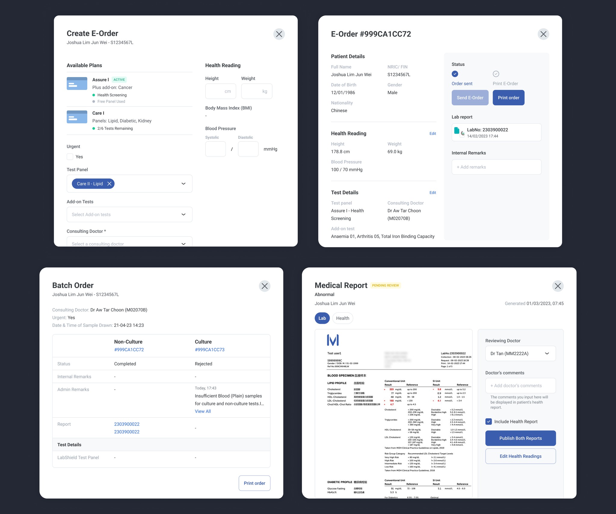
The Product
In order to achieve the client’s goals, we build 2 platforms — a patient portal and a clinic portal.
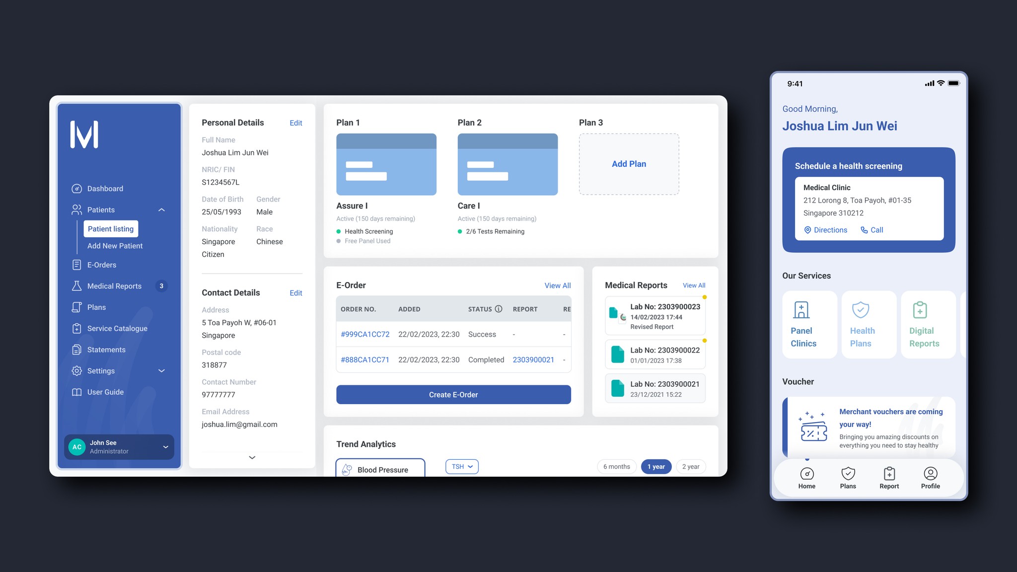
Patient Portal
The patient portal is a mobile web application that customers can utilize to buy plans, store and review their medical reports, and access vouchers offered by the client's partner merchants.
Clinic Portal
The clinic portal is a web application primarily designed for desktop use, enabling healthcare providers to efficiently oversee patient management, generate and transmit digital lab order forms for blood tests, and access patient medical records for comprehensive health assessments.
The Process
The product journey in a nutshell:
Gathering business goals and requirements
Defining the product and its features
Wireframing & prototyping
Design and handoff
Usability testing and beta
Continuous product enhancements
Gathering business goals
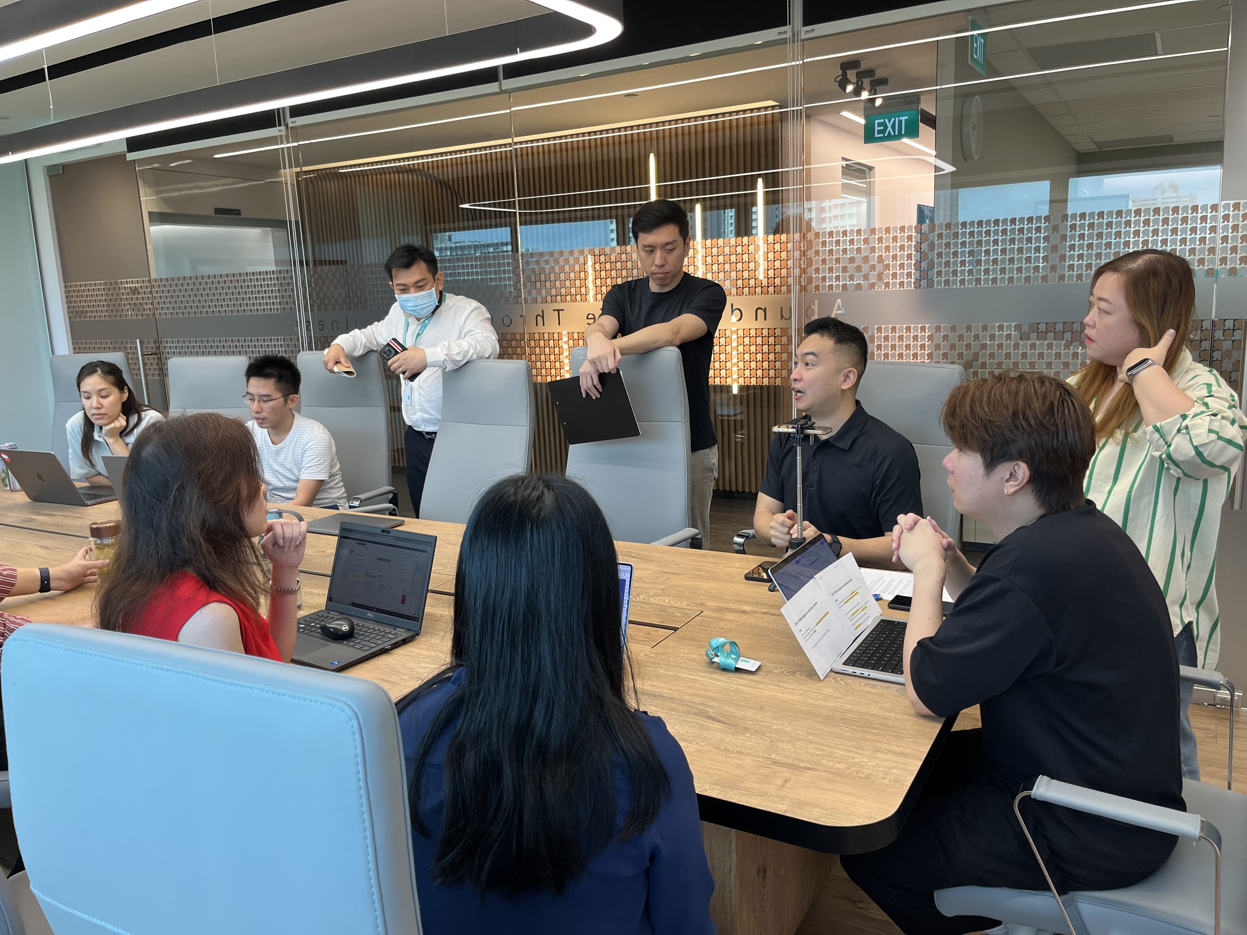
I worked with the wider team to conduct a workshop with the client to understand their vision for the product. We sought to understand the product’s target audience, its value proposition, and the business goals they hoped to achieve.

The client sought to leverage its position as a laboratory diagnostics provider to provide cost-effective blood tests and health screening plans to customers. They aimed to capitalize on their existing partnerships with healthcare providers to streamline the sale of these plans, create avenues for blood sample collection, and enhance continuity of care by enabling the seamless sharing of patients' medical records with clinics.
Defining the customer journey, service blueprint
With a general idea of the product’s offerings, I began plotting the customer journey from end-to-end together with the other designers: From product discovery to purchasing a plan, scheduling and attending a blood test, and finally reviewing their digital medical reports. We used this to craft an initial service blueprint in order to better understand the internal processes that will be involved in providing the service to the customer.
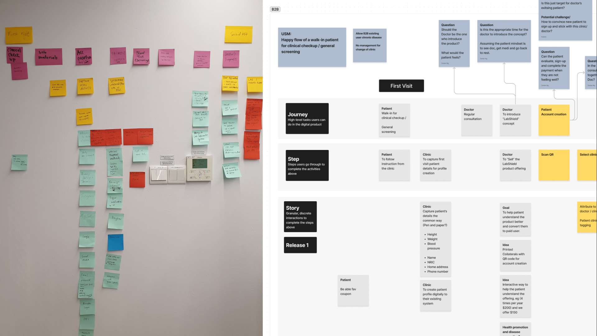
A major point of complexity was figuring out how the product could effectively operate in conjunction with the existing internal laboratory information system, particularly in terms of transmitting lab orders and medical reports. The service blueprint allowed us to visualize the processes required to support the customer through the different touchpoints in their journey.
Examples in this context involve deciding the ideal timing for sending customer emails about plan activation, medical report releases, and creating a system that effectively guides users through their initial health screening and blood test.
Gathering requirements
Throughout the project's duration, I collaborated closely with key stakeholders including the CEO, Head of Business (Product Owner), Marketing (Co-Product Owner), and the Operations team. Alongside our software engineering team, I led discussions aimed at understanding and defining the business requirements and logic for the proposed features and modules. We documented these details and used them as a compass to maintain alignment between our team and the client.


Designing features
After gathering the feature requirements, I collaborated closely with software engineers, product owners, and subject matter experts to formulate user stories and establish acceptance criteria for each story. Subsequently, I used these stories to craft wireframes, prototypes, and high-fidelity designs, which were then handed over to the development team.
In the weeds
Patient Portal
Our goal was to create a secure and efficient patient portal for plan purchases and comprehensive health monitoring through medical reports. I was responsible for designing the purchase flow, the medical report viewing experience, and the health report.

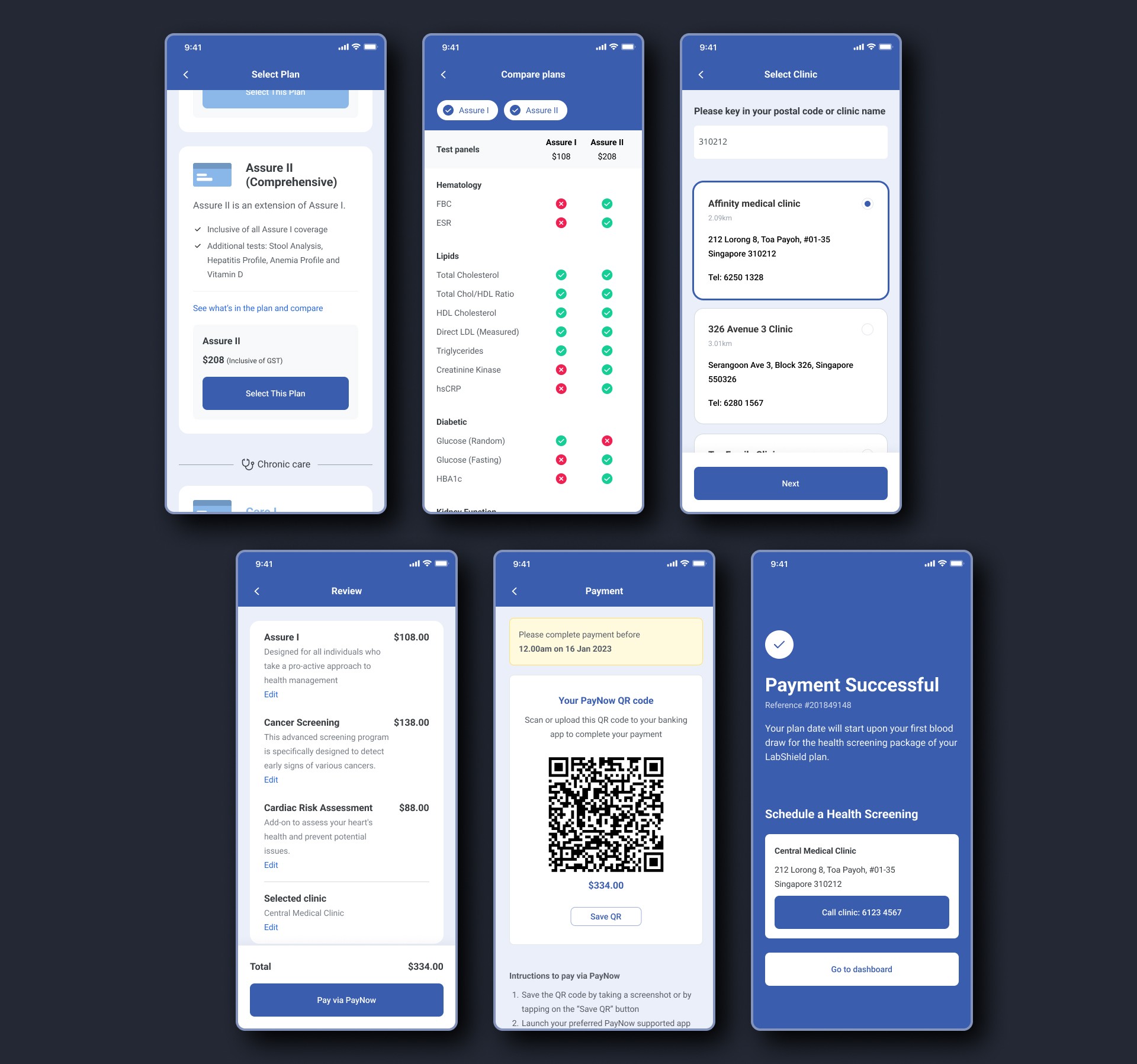
Plan purchase and selecting a clinic
The proposed subscriptions and plans cost a significant amount and as such we had to find a way to allow the user to make an informed decision when purchasing a plan. We had to display the plan’s benefits and its value in detail without overwhelming the user. Additionally, as each plan had multiple tiers, we had to ensure that their differences were highlighted well.
Given the client's eagerness to be an early market entrant and stay ahead of government initiatives, we made a deliberate choice to expedite the product’s development, even if it meant excluding a core feature – in this case, scheduling a consultation, which ideally would have "closed the loop" in the user journey. This omission resulted in an off-platform gap in the process that required effective management. The insights section under usability testing covers how we addressed this. Click here to jump to the section.
Viewing lab, health, and trend reports
Users are also able to view their lab and health reports digitally once the lab publishes the results. As each test could generate these documents as a pair - since the health report draws data from lab reports to generate its content, I listed the reports under each lab order.

I collaborated closely with the operations team and drew reference from competitors' health reports to craft the client’s brand of health reports. This served to present the lab report data in a concise and easy-to-understand format. To achieve this, we provided summaries for each aspect of their health and avoided technical terms whenever feasible.
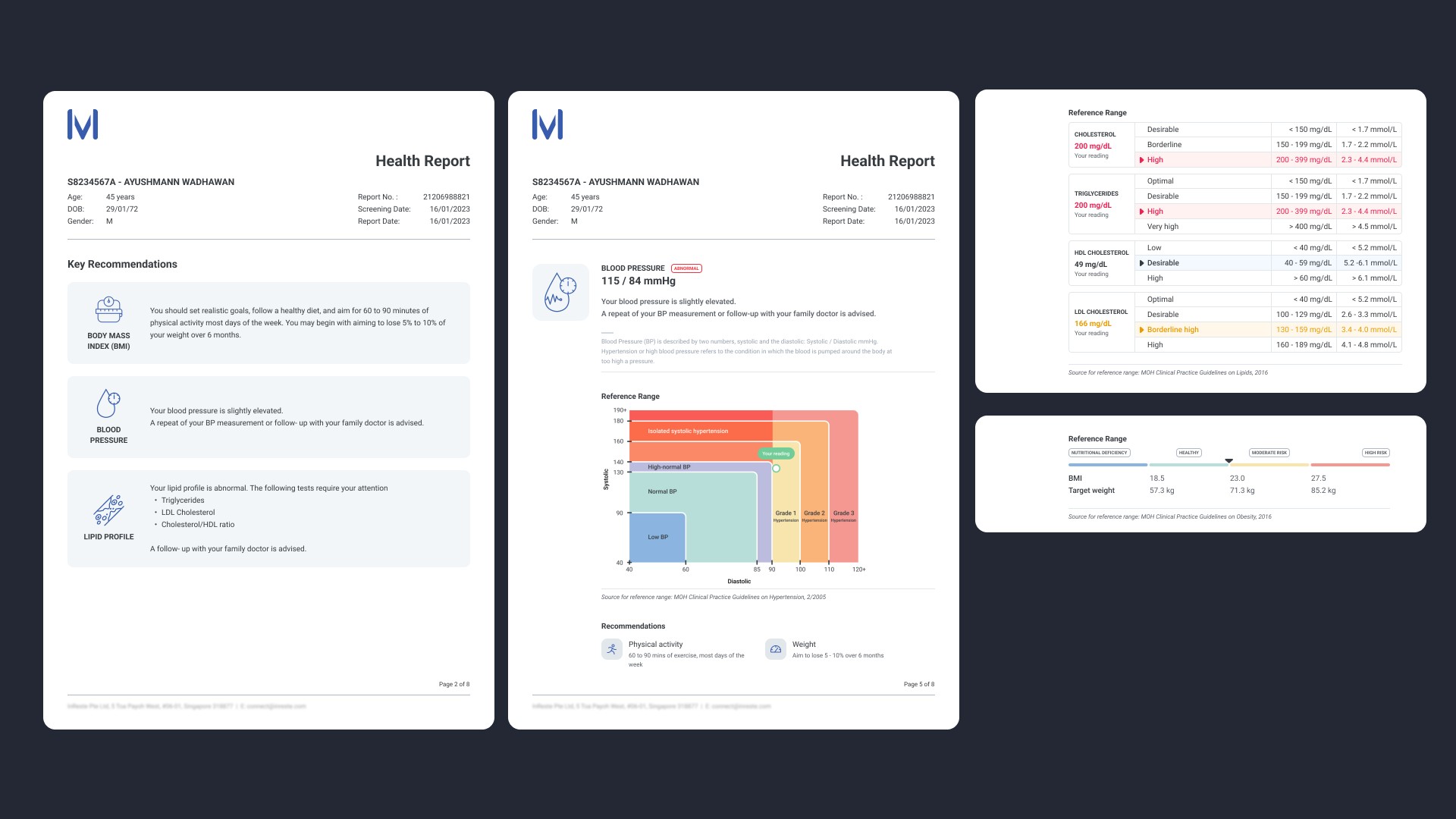
Trend reports serve the purpose of enabling patients and doctors to monitor their health indicators consistently over time. This feature proves particularly valuable for patients with chronic conditions, where ongoing tracking of health metrics holds greater significance. We designed and implemented this feature, albeit at a basic level, recognizing that its full potential would be realized when multiple data points could be collected.
Clinic portal
The clinic portal is a web application primarily designed for desktop use, enabling healthcare providers to efficiently oversee patient management, generate and transmit digital lab order forms for blood tests, and access patient medical records for comprehensive health assessments.
Our design philosophy for the clinic portal was to deliver an efficient platform that seamlessly integrated with the clinic's workflow and could accommodate the high patient throughput typical in most clinical settings. I was responsible for designing a range of core features, including patient management, E-Order creation, and medical report management. I also designed secondary supporting features such as statements and trend reports.

Patient Management
Healthcare providers are able to use the platform to add, delete, and manage patients together with their purchased plans.
On the patient's detail page, aligned with our objective of providing an efficient platform, we structured all crucial information within a dashboard-style page comprising multiple cards, offering a concise overview of the patient's data. Our aim was to minimize the need for extensive navigation when users have specific objectives in mind, whether it's creating an E-Order, reviewing the patient's reports, or managing their plans.


E-Orders
Digitizing the physical lab order system was a complex and massive undertaking. We needed to first gain a deep understanding of the technology and processes of the existing laboratory information system, responsible for handling all incoming orders. Additionally, we had to familiarise ourselves with the physical process of conducting a blood test, starting from blood collection and the transportation of samples and lab order forms to the laboratory. We then needed to grasp how the lab received, processed, and eventually released medical reports for these tests. I worked closely with the Ops team and software engineers to gather and document these processes and designed the E-Ordering system to replace the existing physical process.


A particular challenge was to ensure that the design did not overly burden the clinic staff with additional workload or prolong their existing patient workflow. To address this, we took an approach that included using terms and structuring the order of fields to closely resemble the physical form, while making necessary improvements as needed. Our goal was to minimize any friction in the transition to a digital format by presenting the form in a manner that aligns with the mental models already established by the clinic staff.

Medical Report Management
Medical report management is a fundamental feature required to accomplish the goal of enhancing the quality of care delivered by physicians through the sharing of patients' medical records. To create this feature, we closely consulted existing Clinic Management Systems and conducted interviews with doctors to inform our design approach. We specifically focused on ensuring that doctors receive timely notifications about reports containing abnormal or critical results and considered the traditional face-to-face processes of communicating information to patients. It's worth noting that our objective was not to entirely replace these processes but to complement them.


Panels
For the user journeys expected to be part of daily routines, we adopted a side panel approach instead of using full pages. This approach was applied in scenarios such as E-Order forms and medical report management. Our primary goal was to enable clinic users to seamlessly transition to or initiate other tasks without being entirely diverted from their current context, thanks to the continuity provided by side panels.
Usability Testing
We conducted 2 rounds of usability tests for the product in its alpha stage which involved 5 users that represented patients, and 3 users that represented the healthcare providers. I led the design team in crafting the research plan and also served as the facilitator for these tests.
Usability test 1
The first test involved a medium-fidelity test environment developed by our software engineers, before the slated Alpha test, and involved internal staff. The primary goal of this test was twofold. Firstly, we aimed to collect feedback on the usability of the patient portal, spanning from the sign-up process to plan purchase. We also sought feedback on the clinic portal, where users created and submitted E-Orders for patient blood tests. Secondly, we used this opportunity to evaluate the customer journey and supporting processes by simulating a mock clinic, complete with a phlebotomist. During this test, blood was drawn from the patient user and sent to the lab for testing. Results were subsequently released digitally on the platform.
Plan purchasing
Users conveyed their hesitancy in purchasing the plans, citing inadequate and unclear information about the plans and their associated benefits. The pricing of the plans further exacerbated this concern. To address this, I enhanced the plan descriptions to provide more comprehensive details about the benefits they offered. Additionally, I also introduced comparison tables to facilitate easier test comparisons within each plan.

Usability test 2
The second test utilised a high-fidelity test environment developed by our software engineers and involved internal staff as patients, and clinics that the client had established partnerships with. In light of the client's desire to present a more polished and refined user interface when engaging with clinics, we transitioned from a lower fidelity prototype to a high-fidelity version. This approach was tailored towards the client’s aim to ensure that clinics would be more receptive to our product, without dismissing it prematurely.
Dashboard
At the outset, the design and product team initially considered a dashboard page a lower priority, as we believed that other features and pages would provide greater value in the MVP. However, the client held a contrasting perspective, deeming it essential. To strike a compromise, I chose to showcase the dashboard in a Figma prototype for testing, a decision aimed at conserving development resources and time, while still allowing for the testing of assumptions and ideas about the clinic portal’s dashboard. I included graphs and stats about subscriptions, revenue, and appointments. We discovered that the doctors preferred the dashboard to be more functional and catered towards day-to-day operations. As such, I redesigned the dashboard to only display patient and E-Order tables, and shifted details about subscriptions to another tab titled “Statements”

Appointments
We also tested the appointments feature through a high-fi prototype as the design and product team had reservations about its feasibility — mainly about clinics needing to maintain an additional appointment system in addition to the one in their own Clinic Management System (CMS).
Through this test, we validated our assumption that without integration with the clinic’s own CMS, clinics will have to duplicate appointments from the portal to their CMS, resulting in double work. For clinics that have high patient volume, the issue of double work is amplified.
Including appointments would have closed the loop in the patient journey to be completely on the platform; from product discovery to purchasing a plan, scheduling and attending a blood test, and finally to reviewing their digital medical reports. However, we came to the conclusion that integration with CMS’s would prove difficult as they do not have an incentive to collaborate with us. As such, we decided to table this feature in favour of working on other features.

E-Order
The e-order scenario featured a patient with a Starter plan, which does not include a complimentary health screening package. Instead, the complementary package, intended to supplement the plan, is offered by the clinic as a separate charge for the patient. Consequently, this charge is recorded as a billable item for the clinic. This arrangement explains why the health screening test options were initially categorized under "Add-ons," as they constitute tests for which the clinic incurs charges.
However, this caused a mismatch in expectations as users thought that the “LabShield test panels” dropdown would contain the most relevant tests, of which the health screening package would be part of. Add in the fact that doctors are pressed for time and cannot afford to search through 200 tests within “Add-ons”, we shifted the clinics’ health screening package options into “LabShield test panels”.
Although this diverges from the system’s logic of having non-billable tests in the first dropdown, it would be more in line with the user’s expectations and will also increase efficiency.

Closed Beta
When we entered closed beta, due to the offline and online nature of the process of purchasing plans and scheduling a blood draw without an appointment feature, users were initially confused about the steps that they needed to take. Our challenge was to find an effective strategy for guiding users to book consultations manually.
To provide more clarity and ease users into the process, we addressed this by adding clear instructions and steps at different touchpoints: Right after purchasing a plan, within the user’s landing page, and through the receipt email.

Learnings and reflections
Digital product development
I gained valuable insights into working with stakeholders who were new to digital product development and had the opportunity to collaborate closely with our team to introduce recommended processes and best practices to them. Additionally, due to our compact team size, I engaged in close collaboration with almost every team member, further enhancing my understanding of the various roles within the product development process.
Furthermore, I had the privilege of participating in discussions that expanded my typical role into areas of business and strategy. This provided me with insights into critical questions such as:
Is your digital product effectively conveying your company's brand value?
Is your current strategy enhancing the digital user experience? Are you delivering a digital product aligned with customer demands?
What sets your digital product apart from the competition?
Design
With a hand in designing most features of the platform, I honed my ability for taking into account multiple viewpoints and considerations when developing a module or feature. This involved skills such as gathering intricate business requirements, collaborating with subject matter experts, and partnering with software engineers to devise solutions that not only served user needs and fulfilled business objectives but also functioned effectively within technical limitations.
Design debt became a challenge as the project evolved rapidly and underwent frequent changes. Balancing the demands of user stories with maintaining a consistent design system proved challenging, resulting in discrepancies as the project expanded. In retrospect, I would opt for a different approach, dedicating time each week to systematically compile and create components for the design system. This would enhance efficiency and ensure greater design consistency.


